Redesigning Onboarding
The challenge was to enhance the onboarding experience to demonstrate value to users before signup.
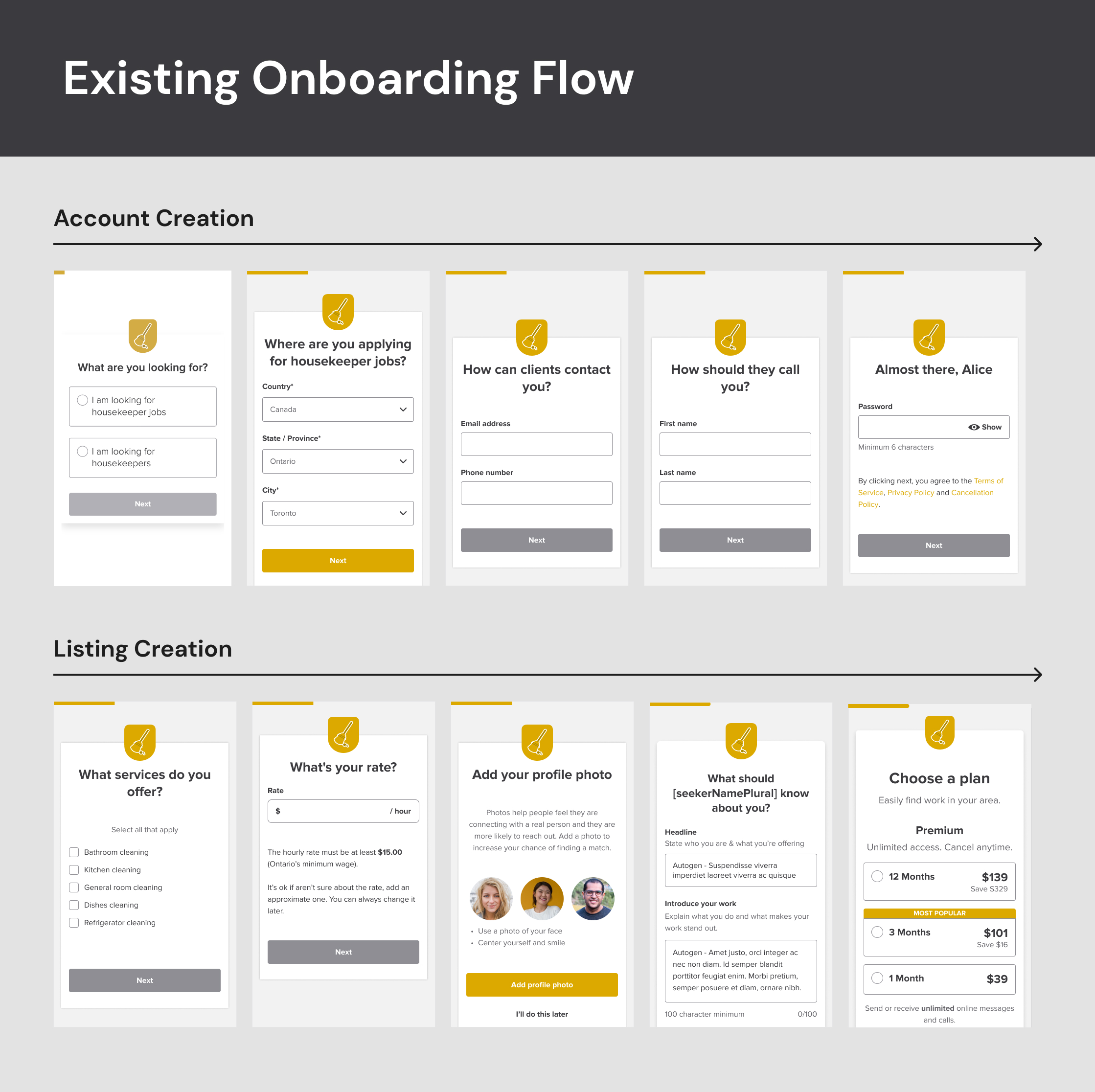
Users expressed a desire to see the value in the platform before lengthy process of creating an account & listing. Existing onboarding process began with account creation which led to drop-offs as users were reluctant to invest time before knowing whether or not the platform has care givers or seekers based on their specific criteria.
Goals
- Increase user engagement and retention by demonstrating platform value early in the onboarding process.
- Streamline the onboarding flow to make it more intuitive and user-friendly.
- Reduce the drop-off rate during the onboarding process during account creation
Research
User InterviewsConducted extensive interviews and surveys to understand user pain points, motivations, and expectations during the onboarding process. Discovered that users wanted to see potential listings before committing personal information.
Competitive AnalysisAnalyzed onboarding processes of competitors and industry leaders to identify best practices and areas for improvement. During competitive analysis discovered different ways of showing value to the user like Upwork's testimonial during job posting creation, Task Rabbit's way of showing users earning potential or Angi's way of showing how many how many users have posted this month.

Solution
We arrived a solution to take iterative approach, first to test flipping the order and design changes. The second iteration was to provide users with the potential listings and keep encouraging them to finish onboarding. With Careguide operating 30 sites, it was imperative to approach changes with caution.
Iteration 1
Reordered the onboarding flow to prioritize value demonstration over account creation. Account creation and listing creation were switched, allowing users to add thier requirements before committing personal details. In parallel, we made visual language updates using existing design system to match the industry standards and provide a better interactive experience. Launched the iteration with 5% of users to gauge initial response.
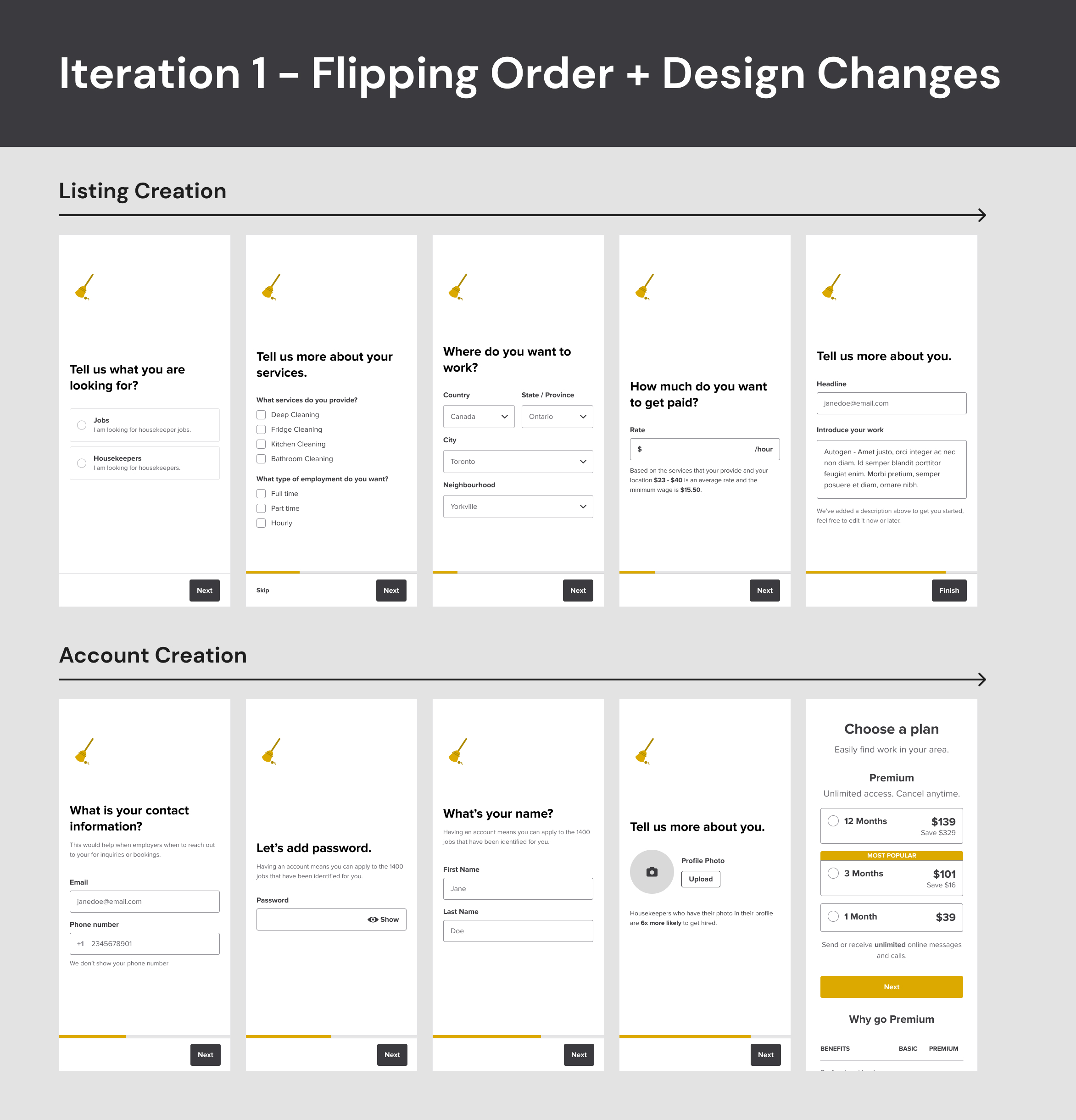
Result: It quite intresting with overall 9% increase in drop-off rate but surprisingly drop-off between steps reduced, indicating an improvement in user flow. So, the users weren't perceiving sufficient value by just allowing them to signup a few stes later. It was confirmed, as demonstrated by the drop-off rate.
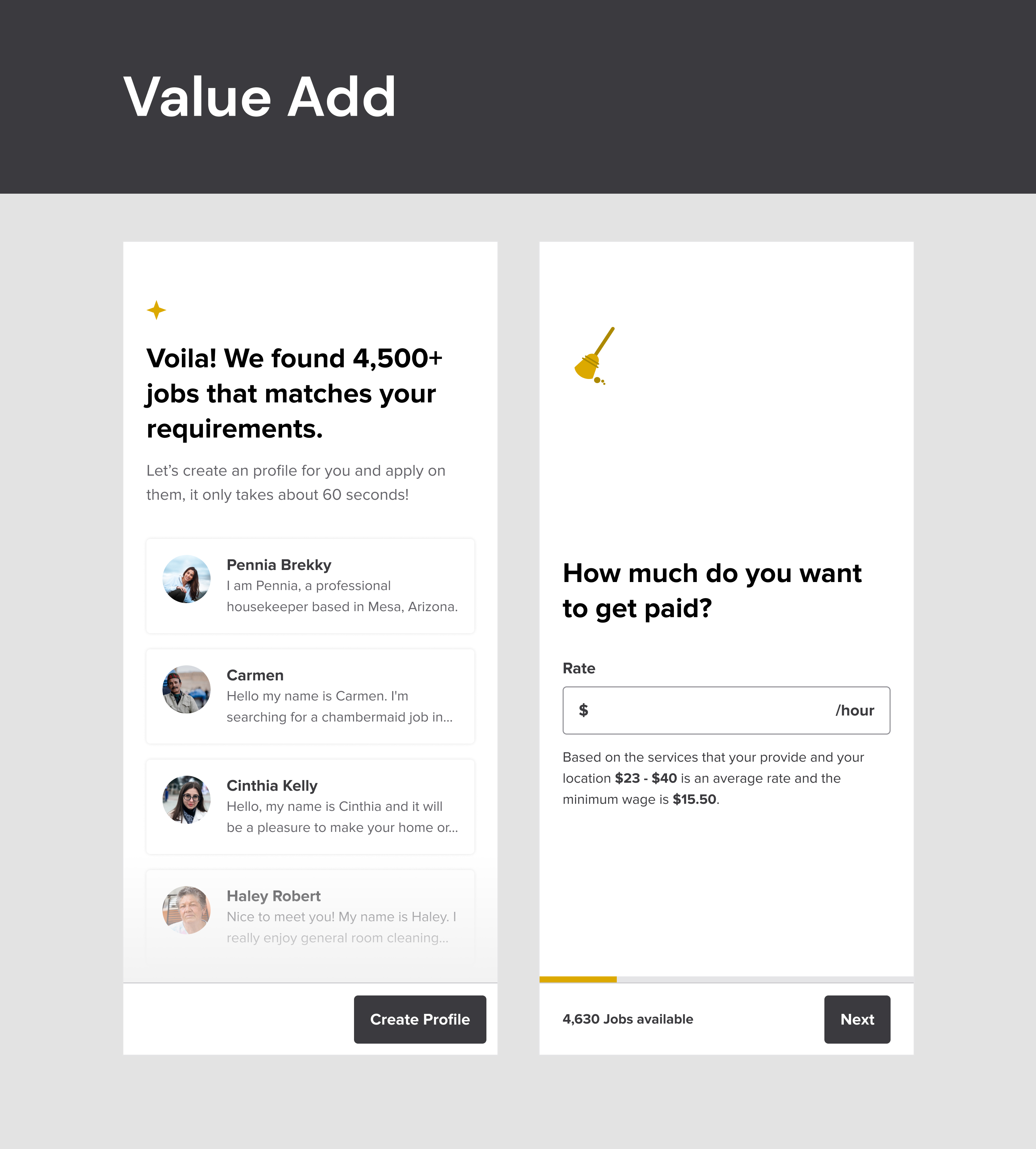
Iteration 2
We provided users value with real time updates on number of listing available according to thier requirement each step of the way. Also, building on the lessons from the first iteration, a screen was introduced to showcase potential listings based on user input. This screen served as an immediate and tangible demonstration of the platform's value proposition. So we now, we asked users about thier requirements while showing them number of potential seekers or providers for them and then show them the list before starting with user creation process.
Impact
+13.6%
-2.5%
-41 Secs
“Onboarding is user's first impression of products"