Unnati - Job Portal
Redesigning for improving customer experience and conversion rates using design thinking
client
Unnati - Recruitment Agency
services
Research, Strategy,
UI Design
UI Design
Timeline
3 Weeks
Tools
Figma, Mural, Miro, Evernote
Grammarly
Grammarly
Case studies can get long and I understand you might not have the time to go through entire process.
Checkout figma prototype if you are looking for final outcome or checkout presentation deck to quickly go through key steps in process.
Checkout figma prototype if you are looking for final outcome or checkout presentation deck to quickly go through key steps in process.
Unnati is a recruitment agency based out of India. The agency is now extending its reach to global job applicants. They created a job portal that they use to best match the companies and job seekers. Since they are going global now, they want their portal to reflect that and increase the number of job applicants.
Challenge
Due to COVID-19, job seekers are applying for jobs online now more than ever. Unnati, being a recruitment agency, already has its foot in the market.
- They were getting a very high number of drop-offs during discovery
- They were getting a very high number of drop-offs during job application
- The users don't see them as a modern and global agency yet
Phase 1: Research
Survey
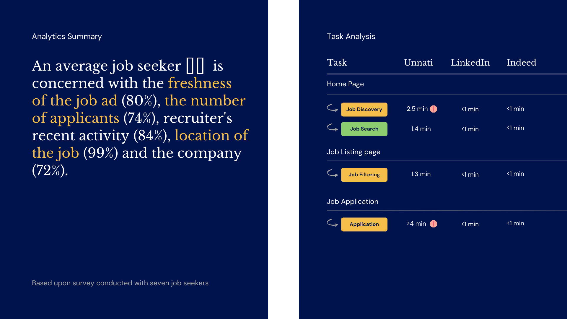
I conducted a small survey with some of the job seekers to understand motivations, user behaviour and pain points of using the app. The survey was shared among 7 job seekers to know more about how job seekers search and apply when looking for job opportunities.
Hueristic Evaluation
Before diving deep into competitive analysis and see what I can learn from other job application portals, I wanted to see what I can learn from this portal itself. I evaluated the existing Unnati web app with heuristic principle to find out current usability issues with the app.
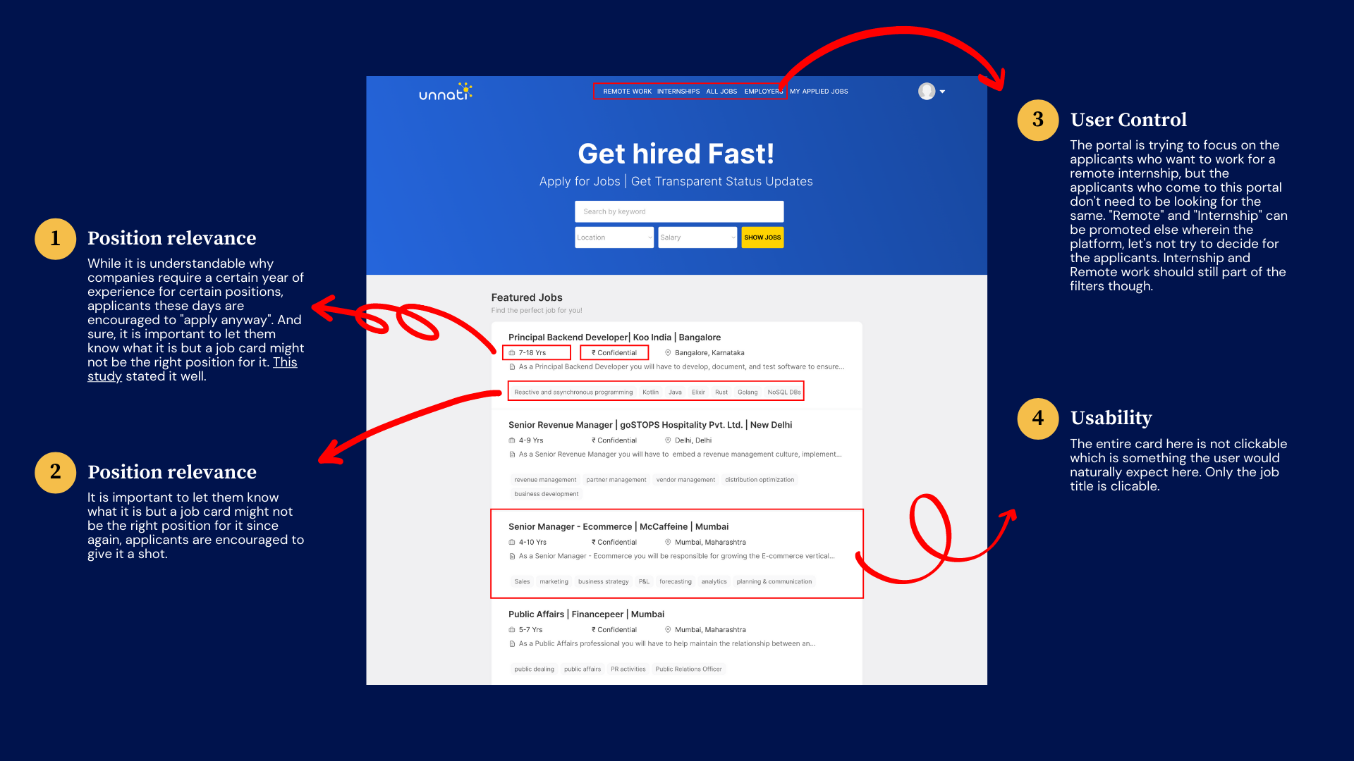
Insights from Hueristic Evaluation
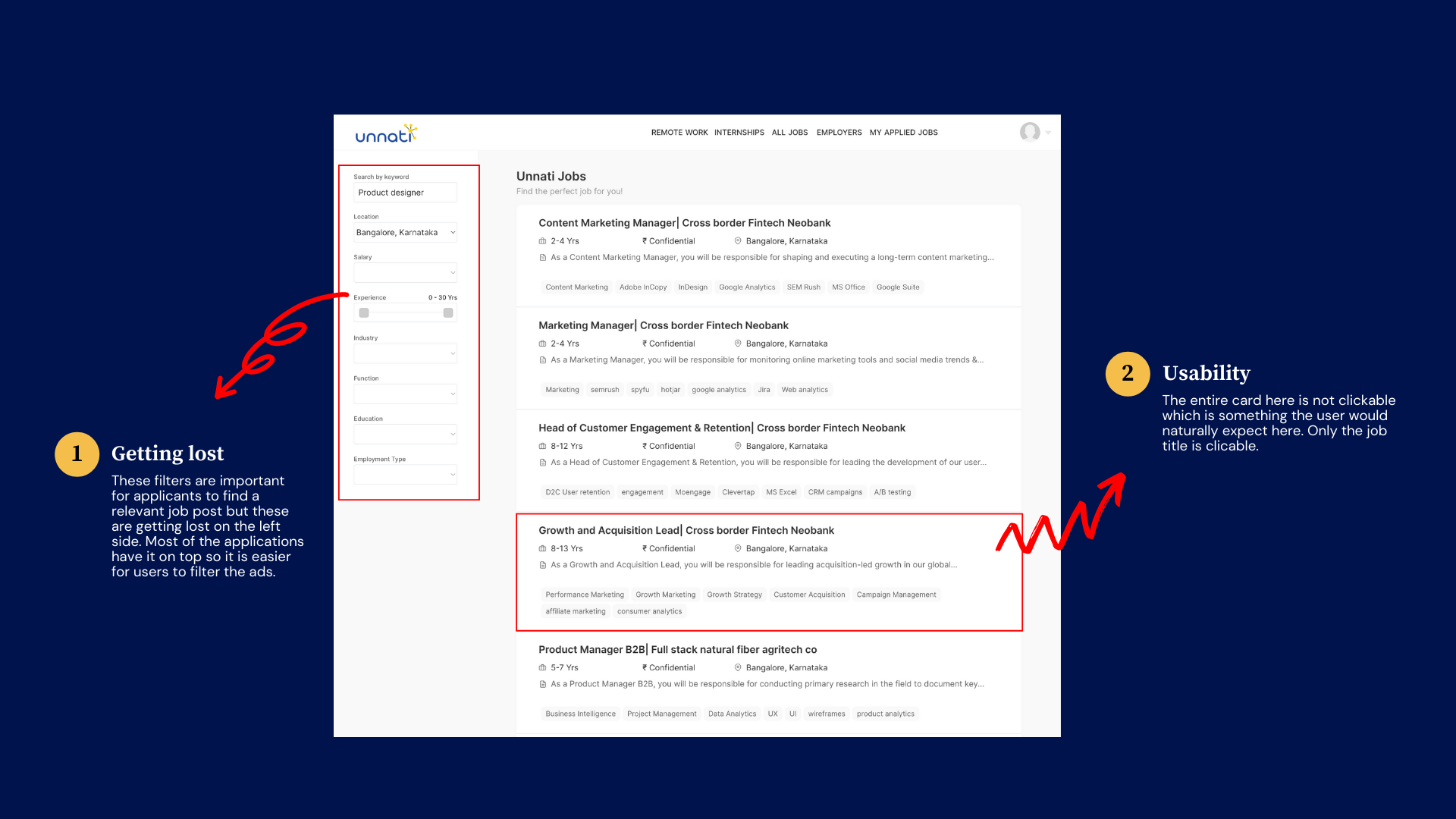
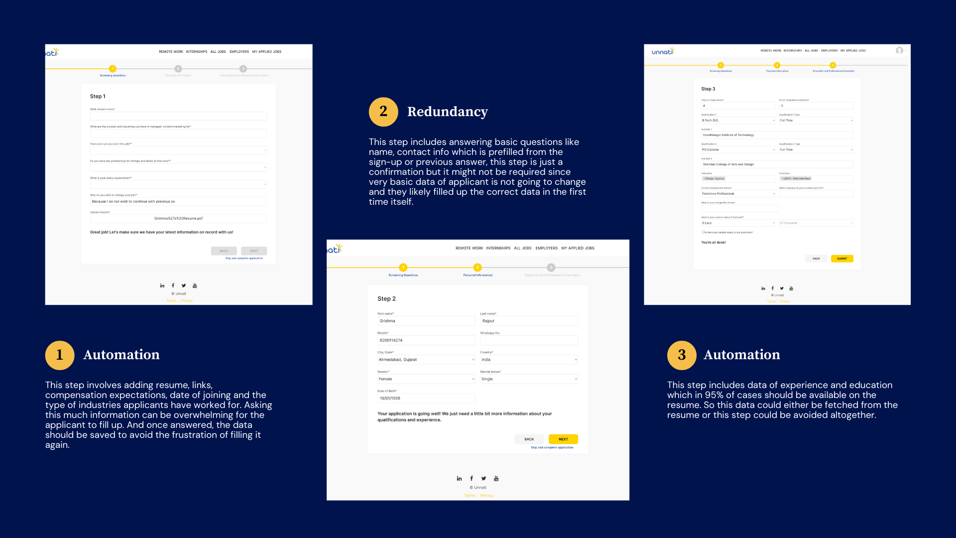
- Application process is long and tedious. Most of the data either could have been fetched from resume, could be filled automatically or just would have been avoided completely.
- Job filters can be on placed somewhere else instead of left for better visibility.
- Overall usability should be improved to make actions more intuitive.
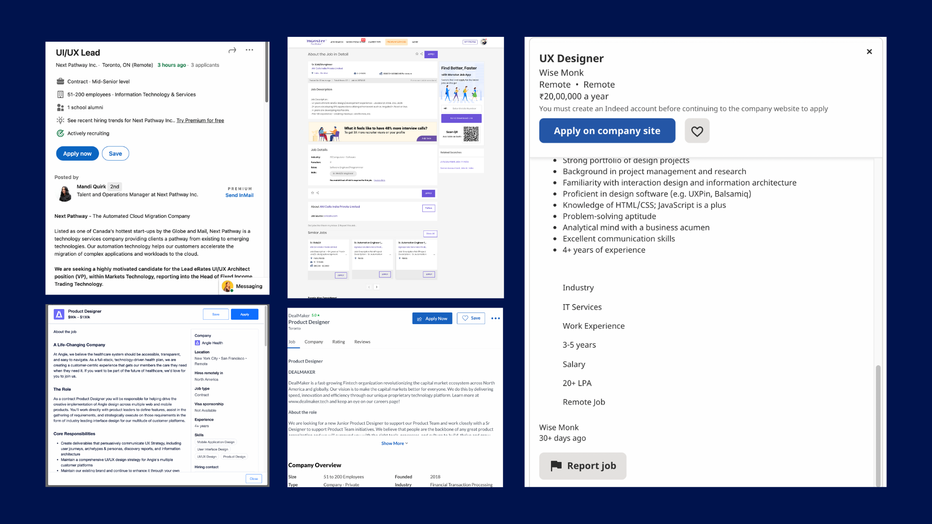
Competitive Analysis
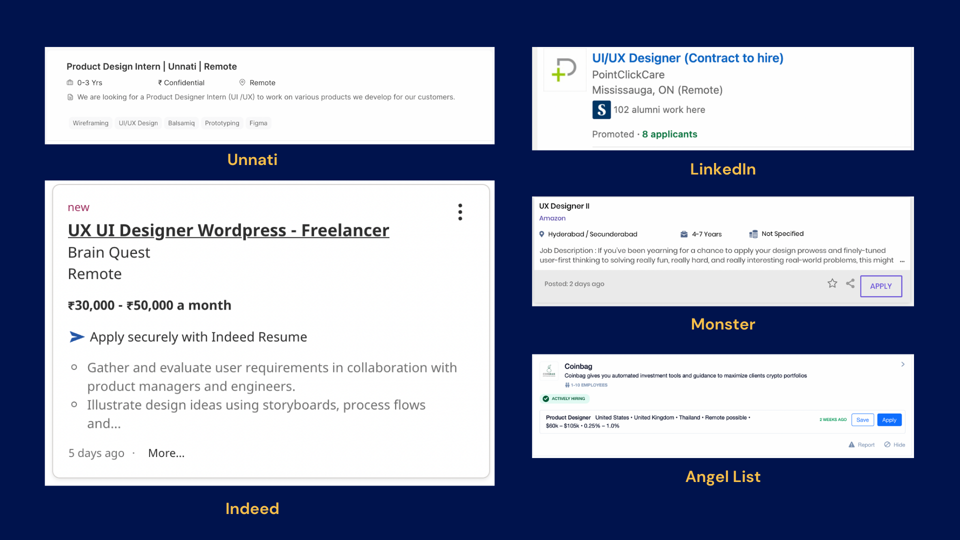
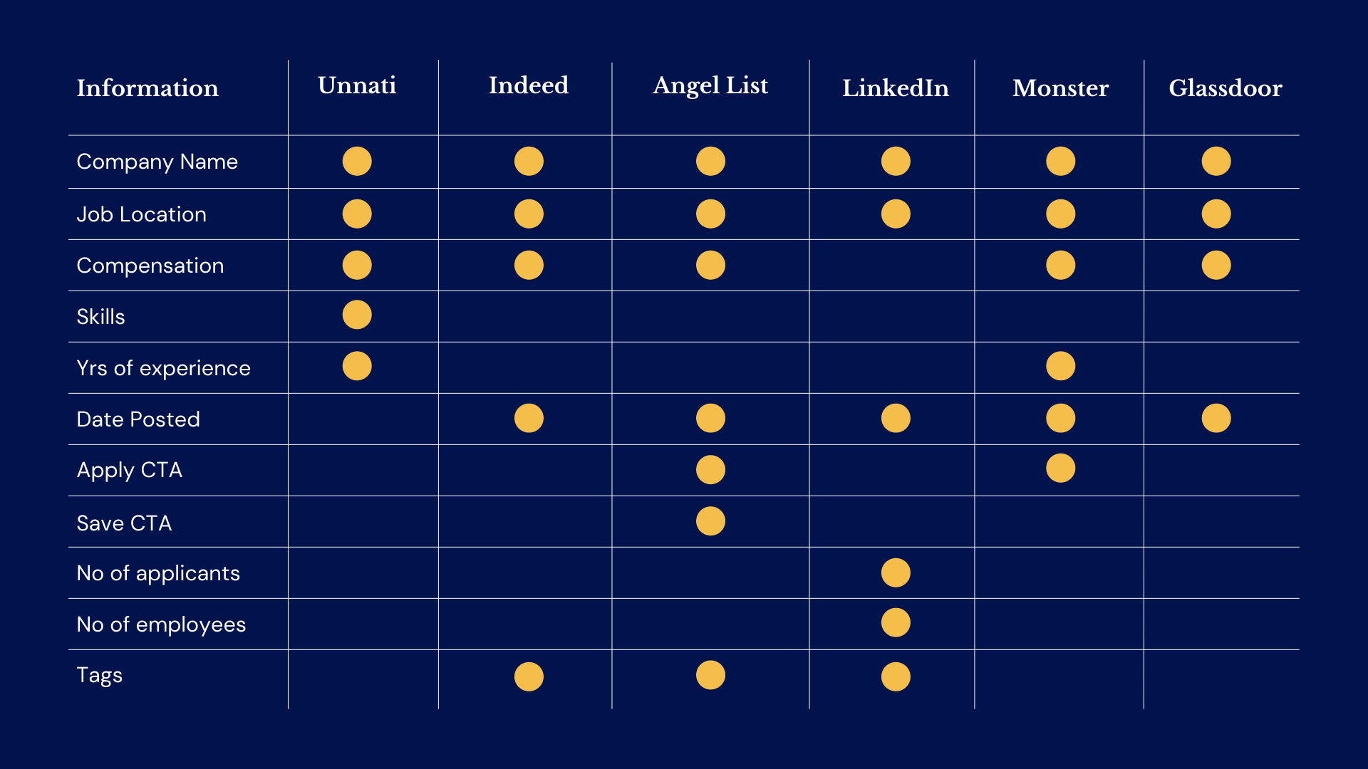
I started with looking at major job portals to understand their strengths and weaknesses in comparison to Unnati's own and to find a gap in the market. I ended up taking screenshots of their search result pages so that I could see what exactly was different among them and what was common as well. The competitors looked into were: Indeed, LinkedIn, Angel List, Monster & Glassdoor.
I analysed them through the angle of information present in the following components also on the steps of application process: Job Card, Job Description Page, Job Filters & Application Process
I analysed them through the angle of information present in the following components also on the steps of application process: Job Card, Job Description Page, Job Filters & Application Process
Insights from Competitve Analysis
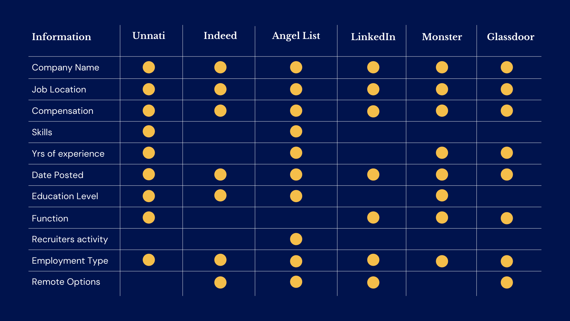
- Job card to have: Job Title, Job Location, Company Name, Company Logo, Compensation, Date Posted, Tags, Company Link, Employment type, Years of experience, Hiring Manager, JOb Description, Job Requirements, Apply Button & Save Button
- Job description page to have: Job Title, Job Location, Company Name, Company Logo, Compensation, Date Posted, Tags, Apply Button
- Job filters to have: Date Posted, Remoted Options, Job Type, Recruiter's activity, Compensation, Experience Level, Company, Industry Type
- Job application process: To be short and concise
Problem Statement
With the COVID-19 pandemic posing economic challenges, mass lay-offs and job losses, people are applying to jobs now more than ever. While this puts job portals in a very profitable position, it also means that applicants would want to apply as quickly as possible and at the most suitable companies.
Going through long & repetitive application forms can be frustrating considering that an applicant applies to at least 3-4 jobs a day with just a possibility of getting selected.
Since some applicants are passive users and may not want to spend a considerable amount of thier time just completing the job application form and finding the right job might lead to an increase in drop-off rates in applicants.
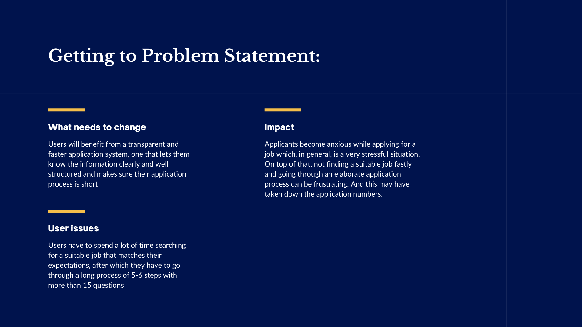
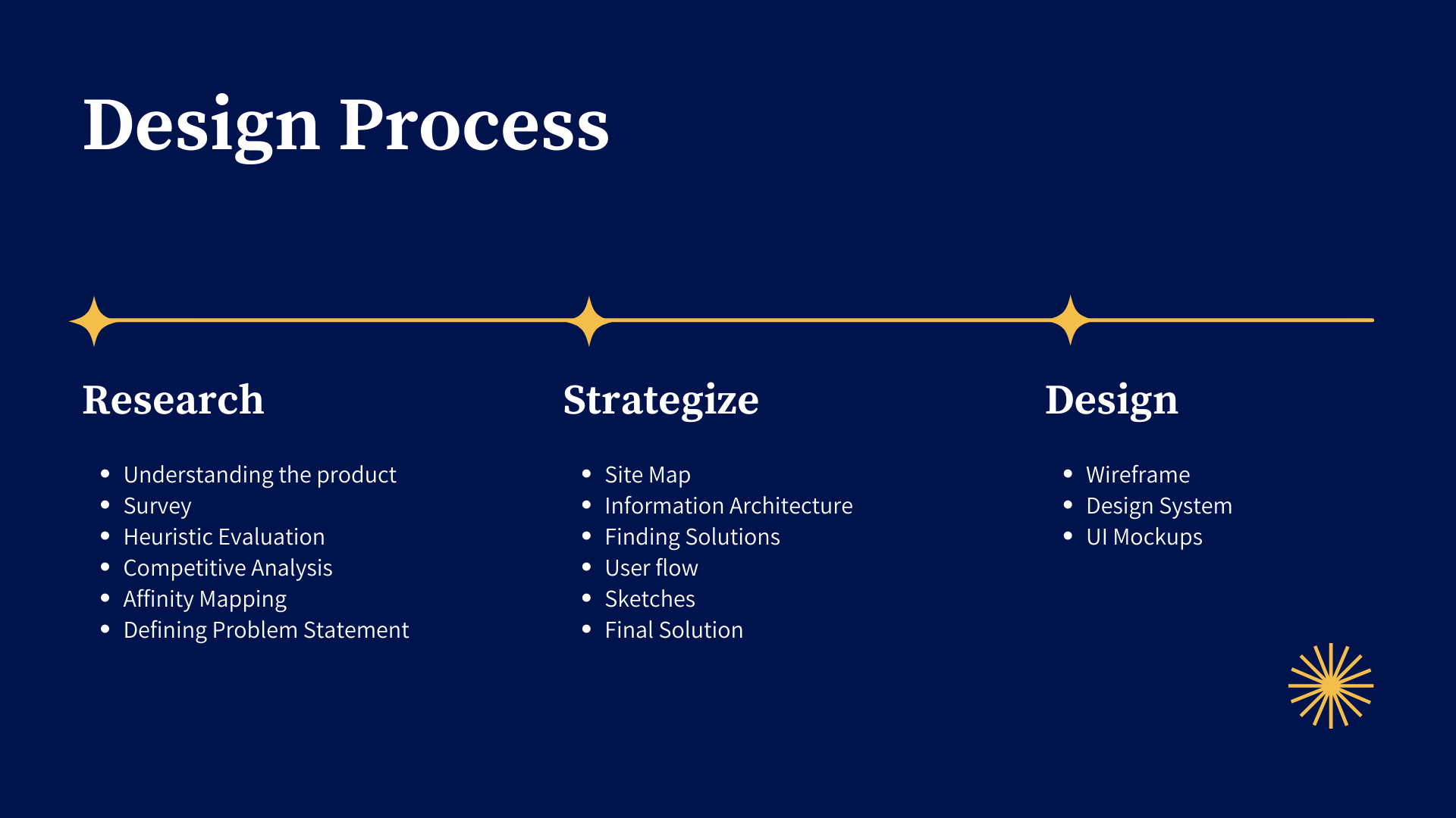
Phase 2: Strategize
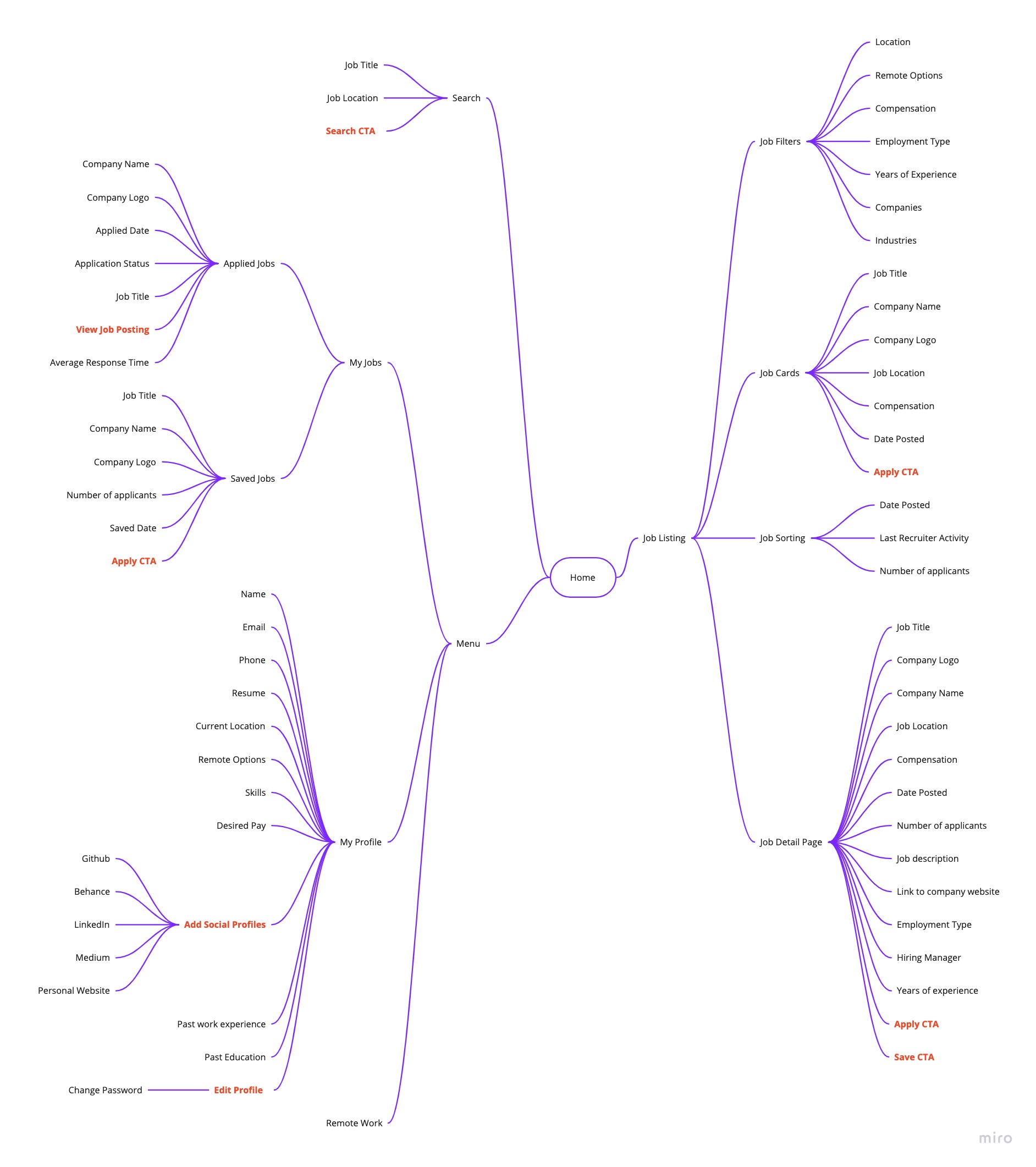
Information Architecture
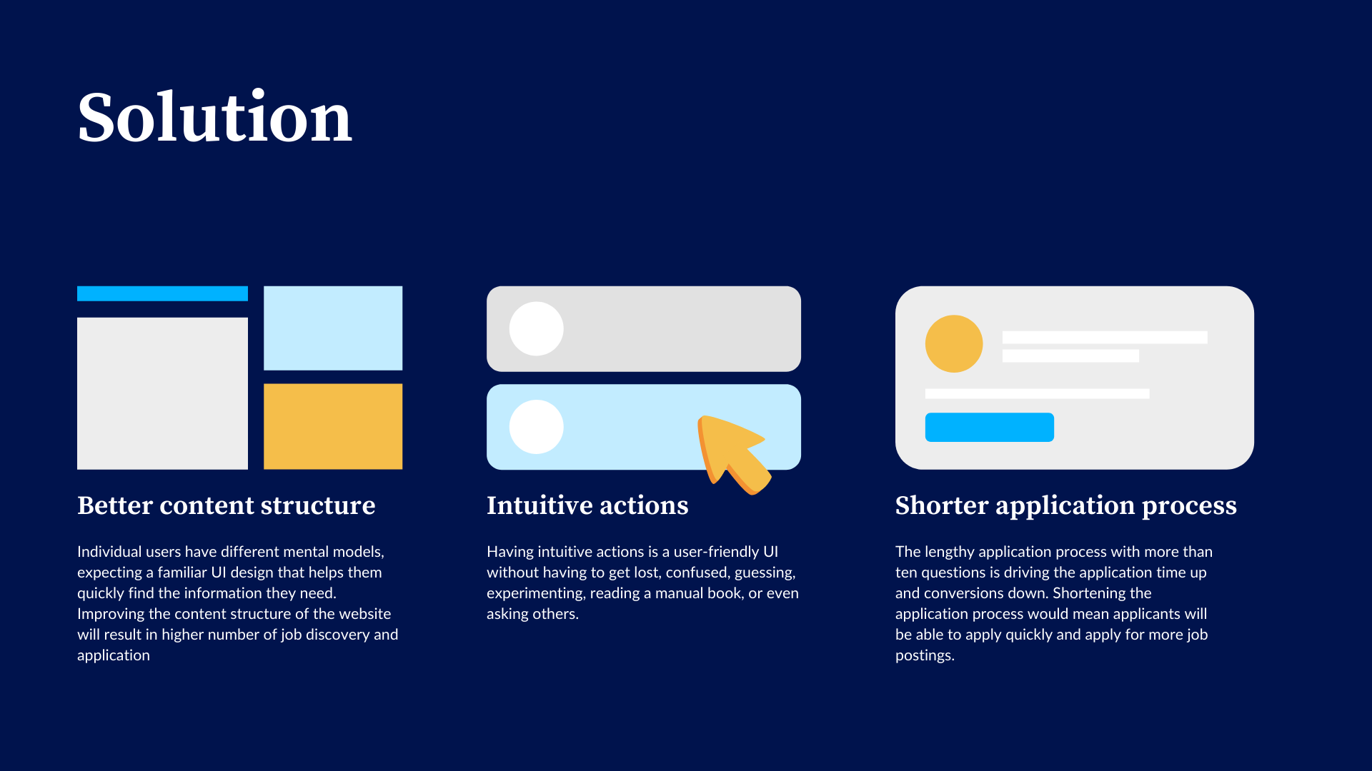
One of the fundamental problems here was the position and allocation of information, through information architecture to help users navigate them to find and process the information they need. A well-designed, user-friendly information architecture ensures that users spend less time and effort searching for information and are successful in finding what they need.
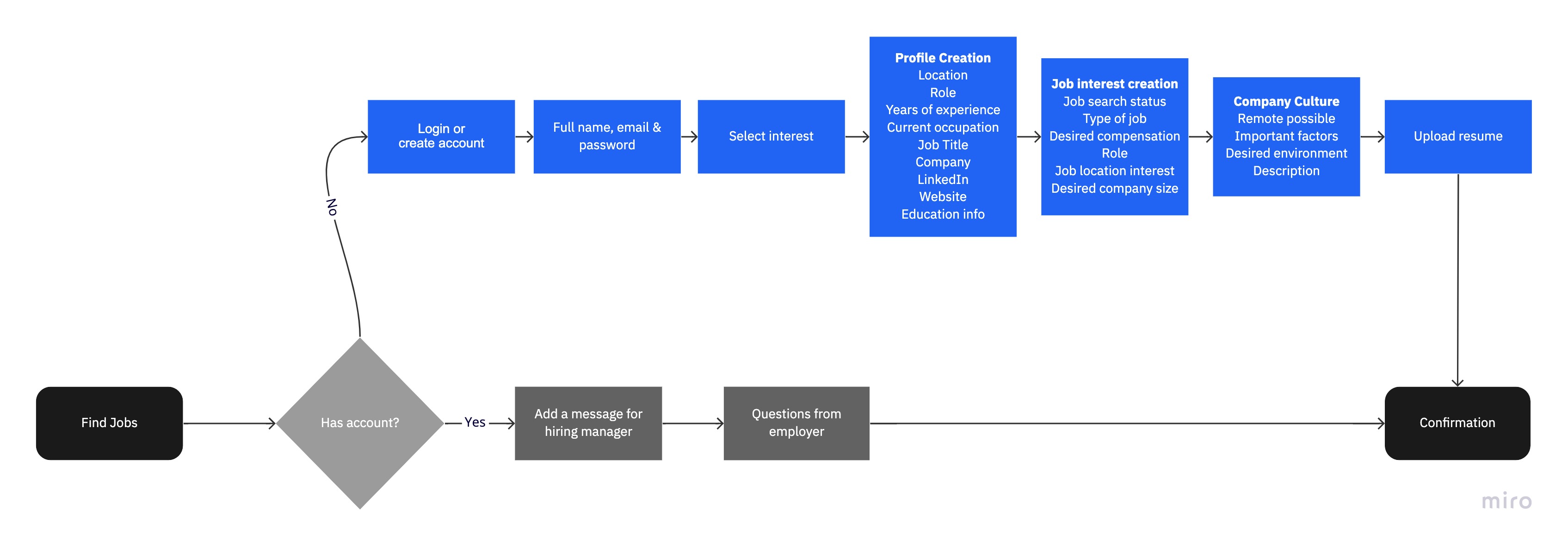
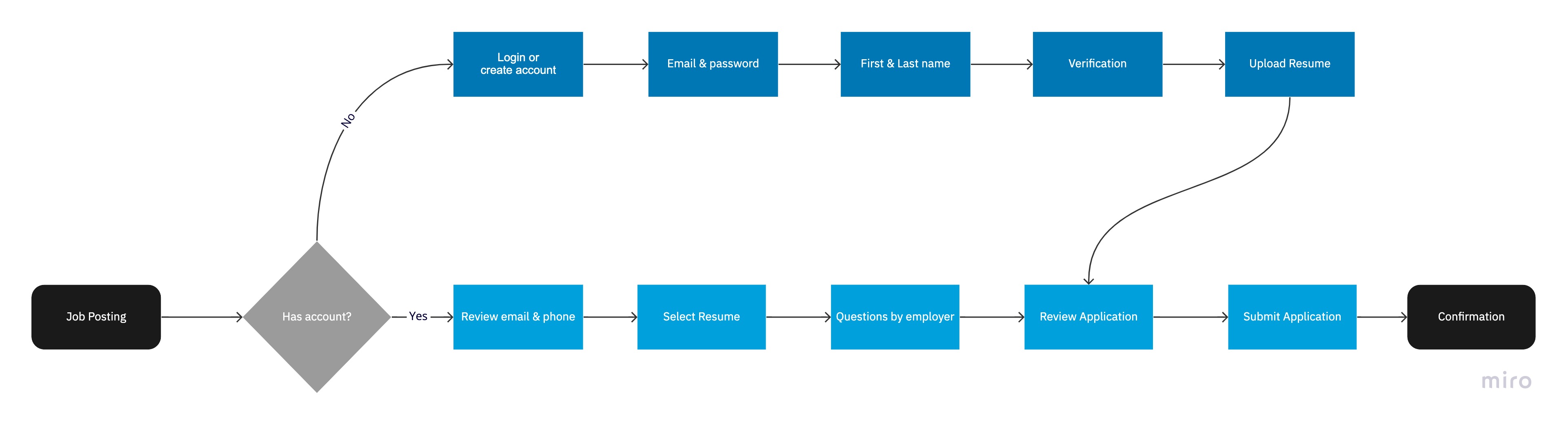
User Flow
I started with looking at major job portals to understand their strengths and weaknesses in comparison to Unnati's own and to find a gap in the market. I ended up taking screenshots of their search result pages so that I could see what exactly was different among them and what was common as well. The competitors looked into were: Indeed, LinkedIn, Angel List, Monster & Glassdoor.
Indeed Application User flow
Angel List Application User flow
LinkedIn Application User flow
Monster Application User flow
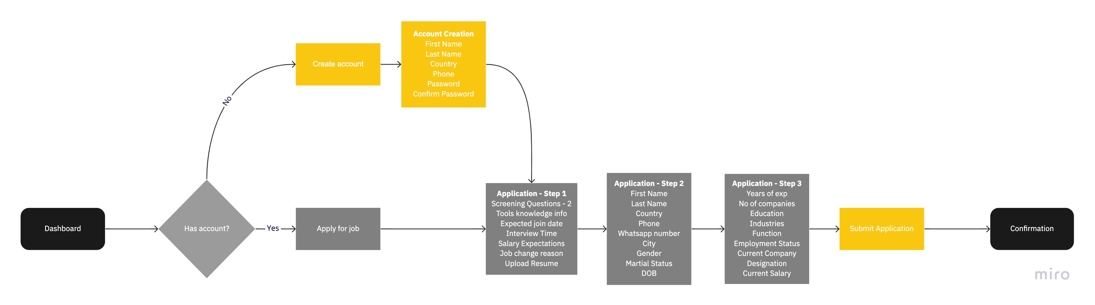
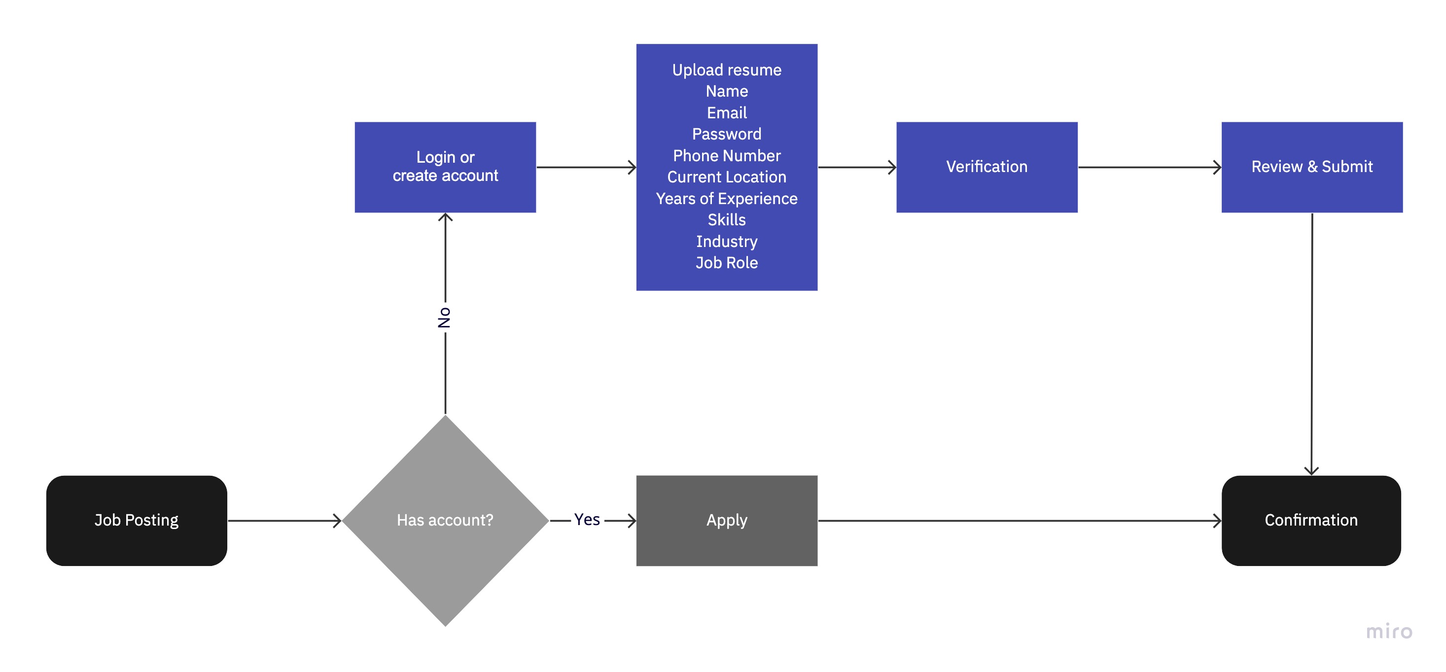
Current Unnati Application User flow
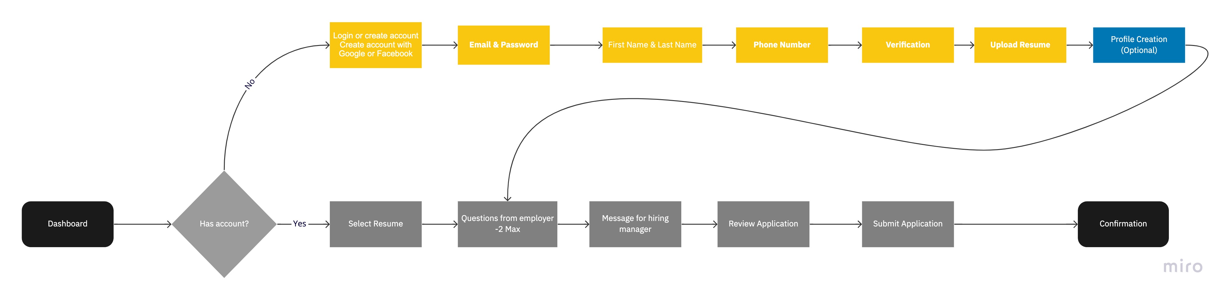
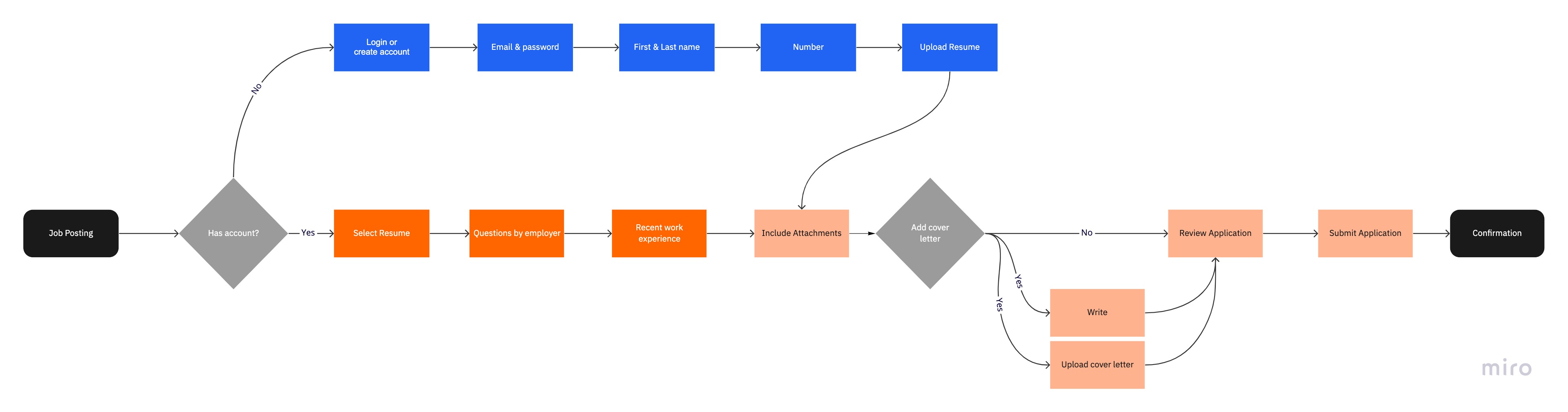
Proposed Unnati Application User flow
Proposed User flow
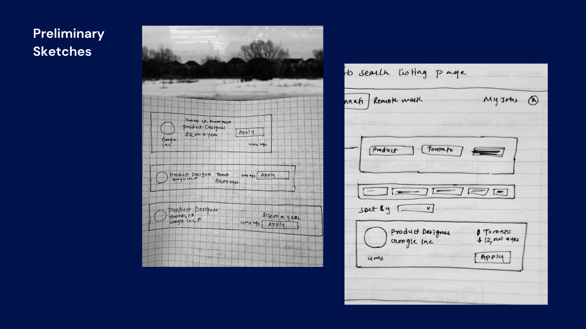
Skteches
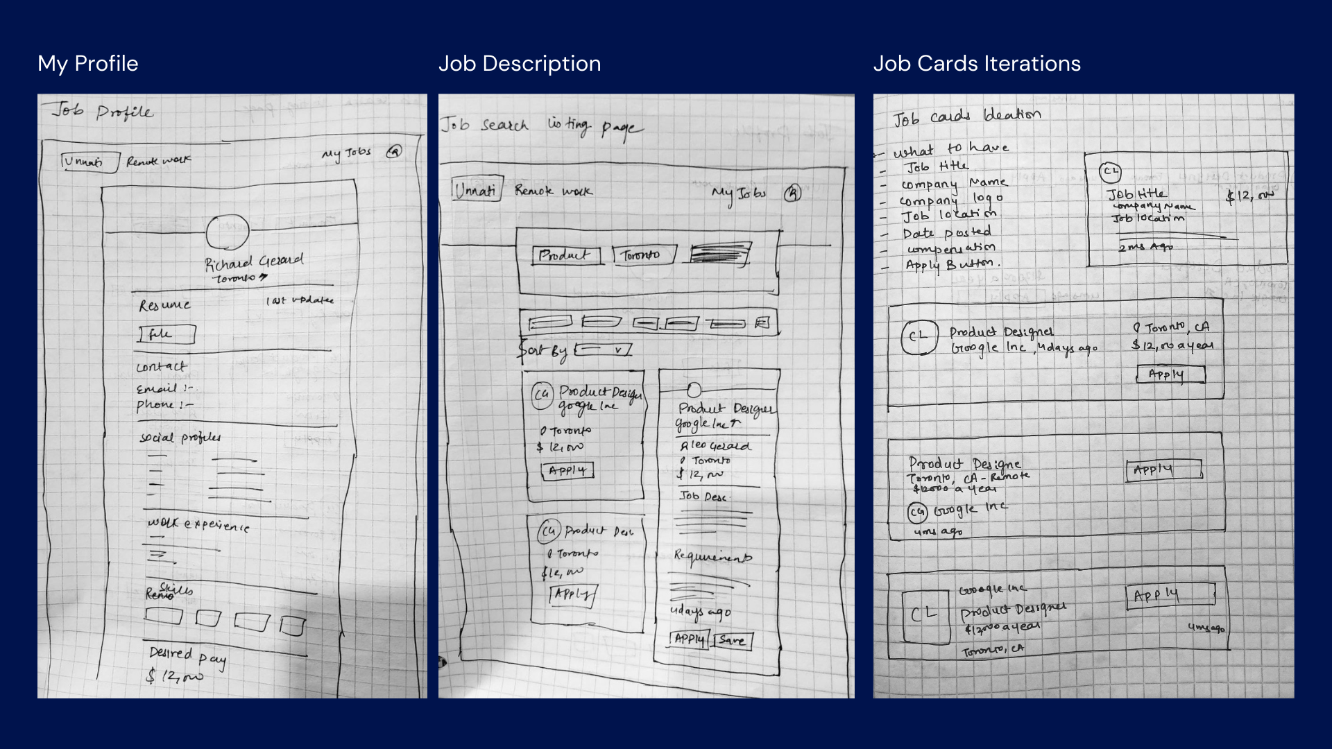
I started by sketching out some low-fidelity screens.
Phase 3: Design
Wireframes
I ran usability tests on our low-fi sketches, which led to our first version of a low-fi prototype. These are very high level wireframe to get an idea of structure of the content
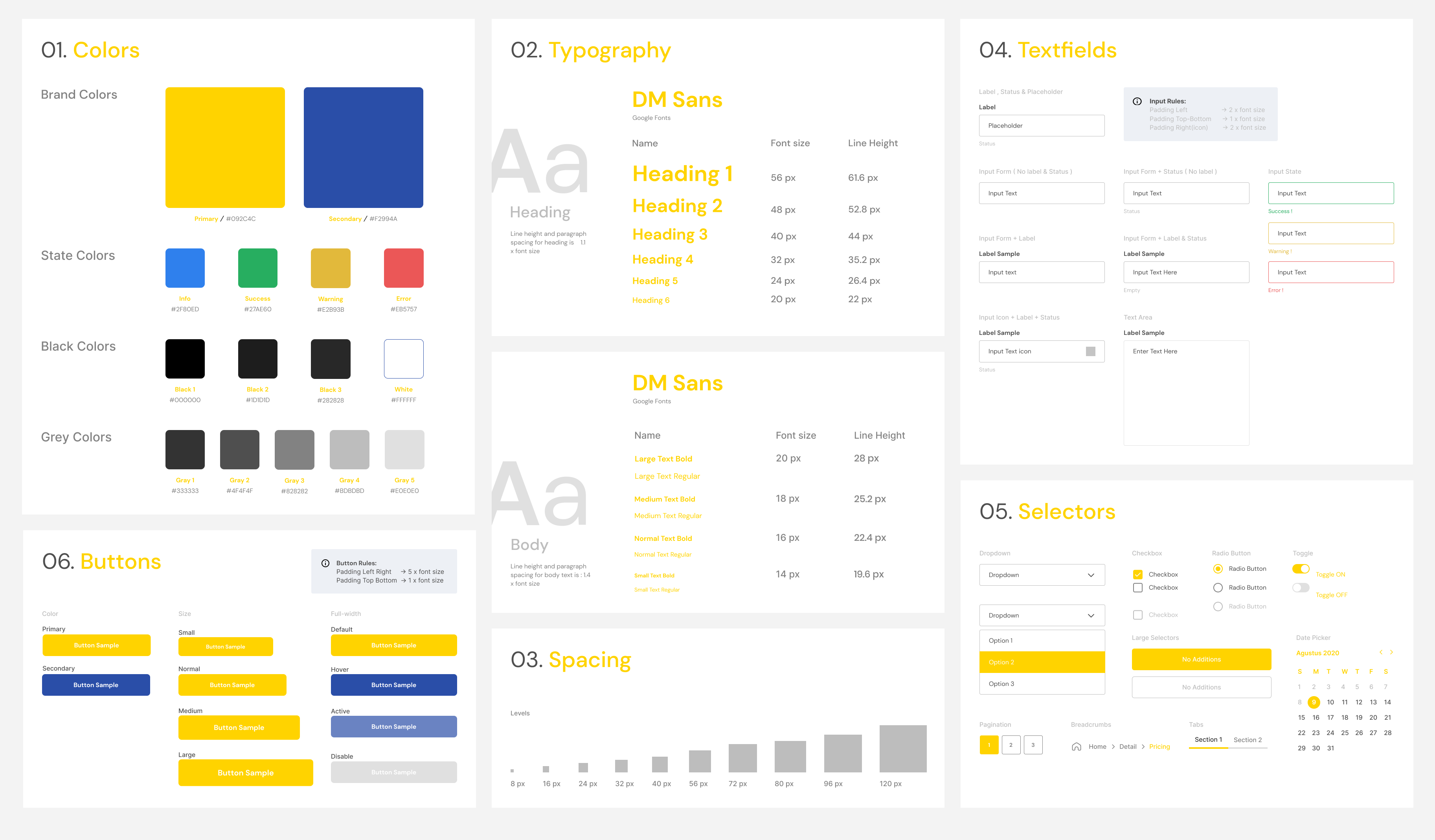
Design System
On the design side I broke components down into primary and secondary states which signified items with code parity and those that were to be considered experimental or work-in-progress. Components were also broken into individual libraries that represented unique codebases — all of which pulled brand elements from a central “Core’ library.
UI Design
And... it was time to see sketches come to life. I broke down it down into flows - Job search & filtering flow, Job application flow, My Jobs flow and user profile
Job search and filtering
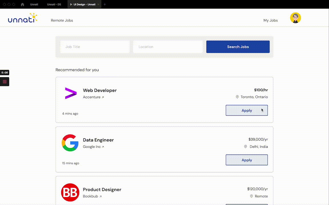
Job Search Flow
Approaches
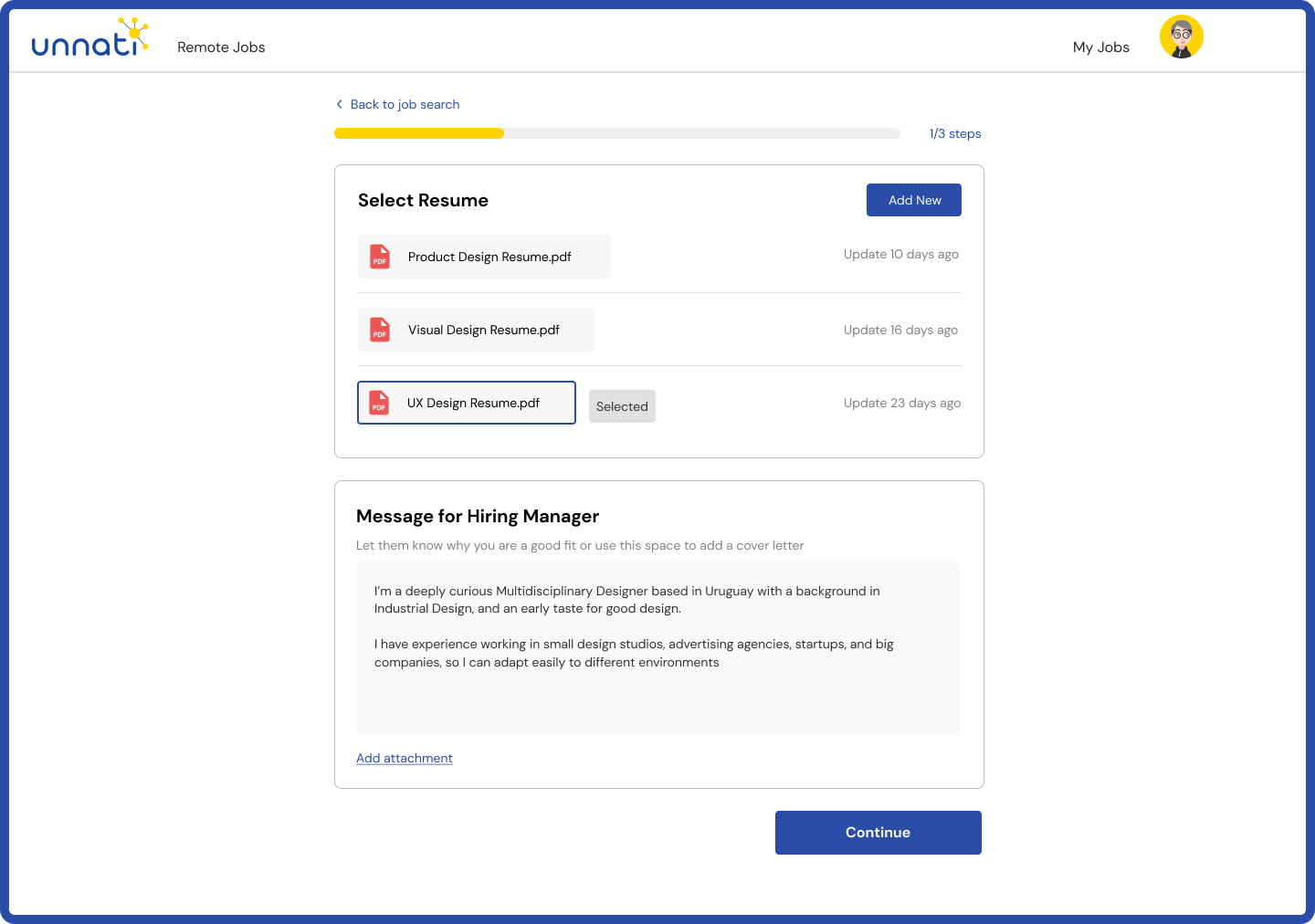
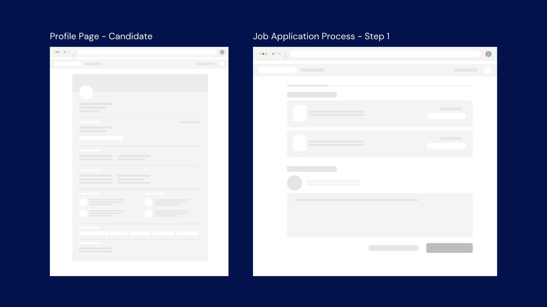
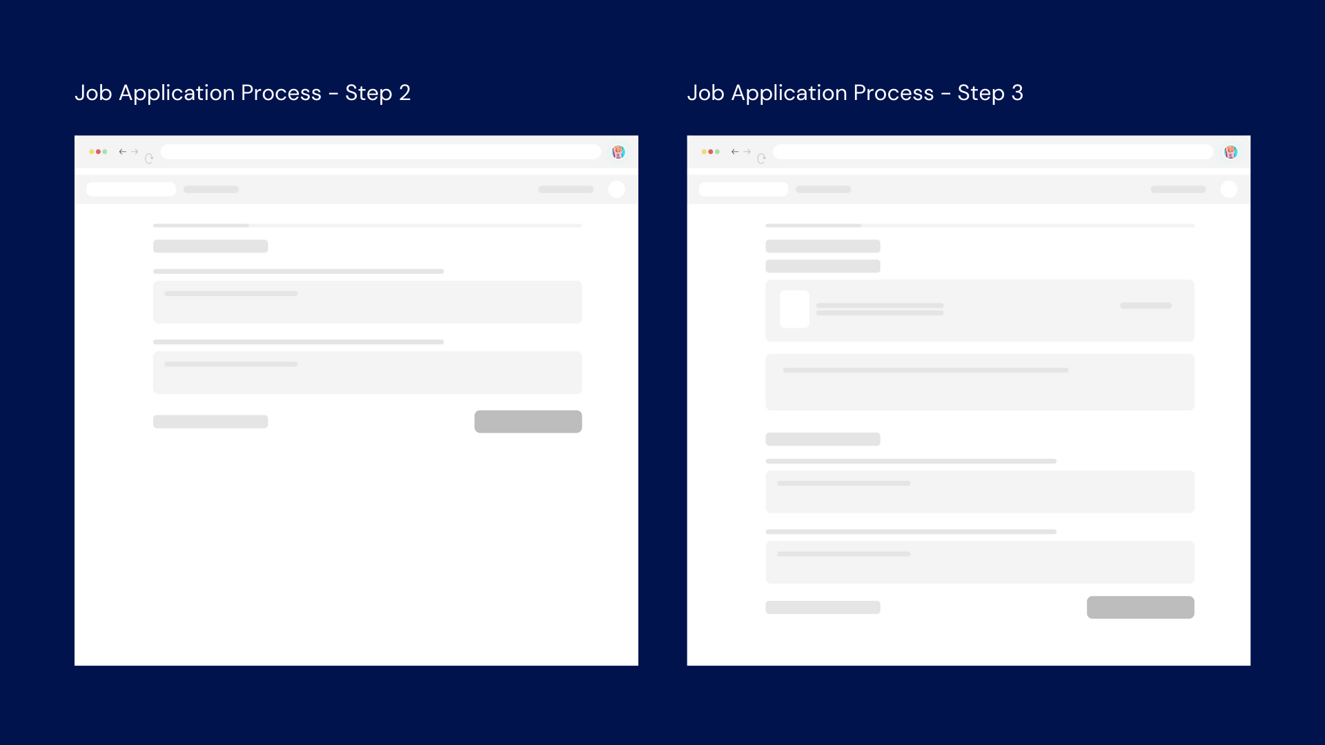
Application Process - Step 1
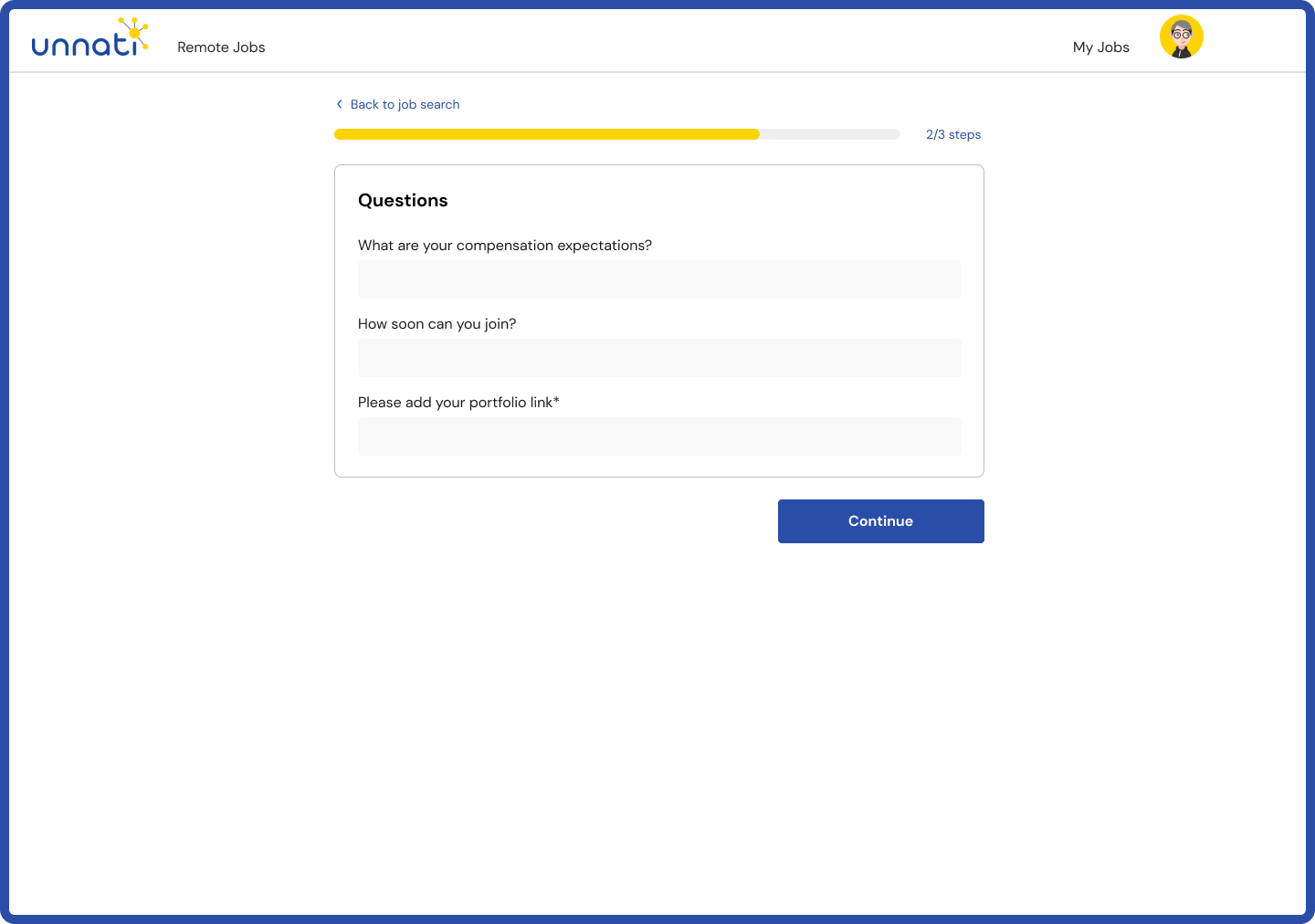
Application Process - Step 2
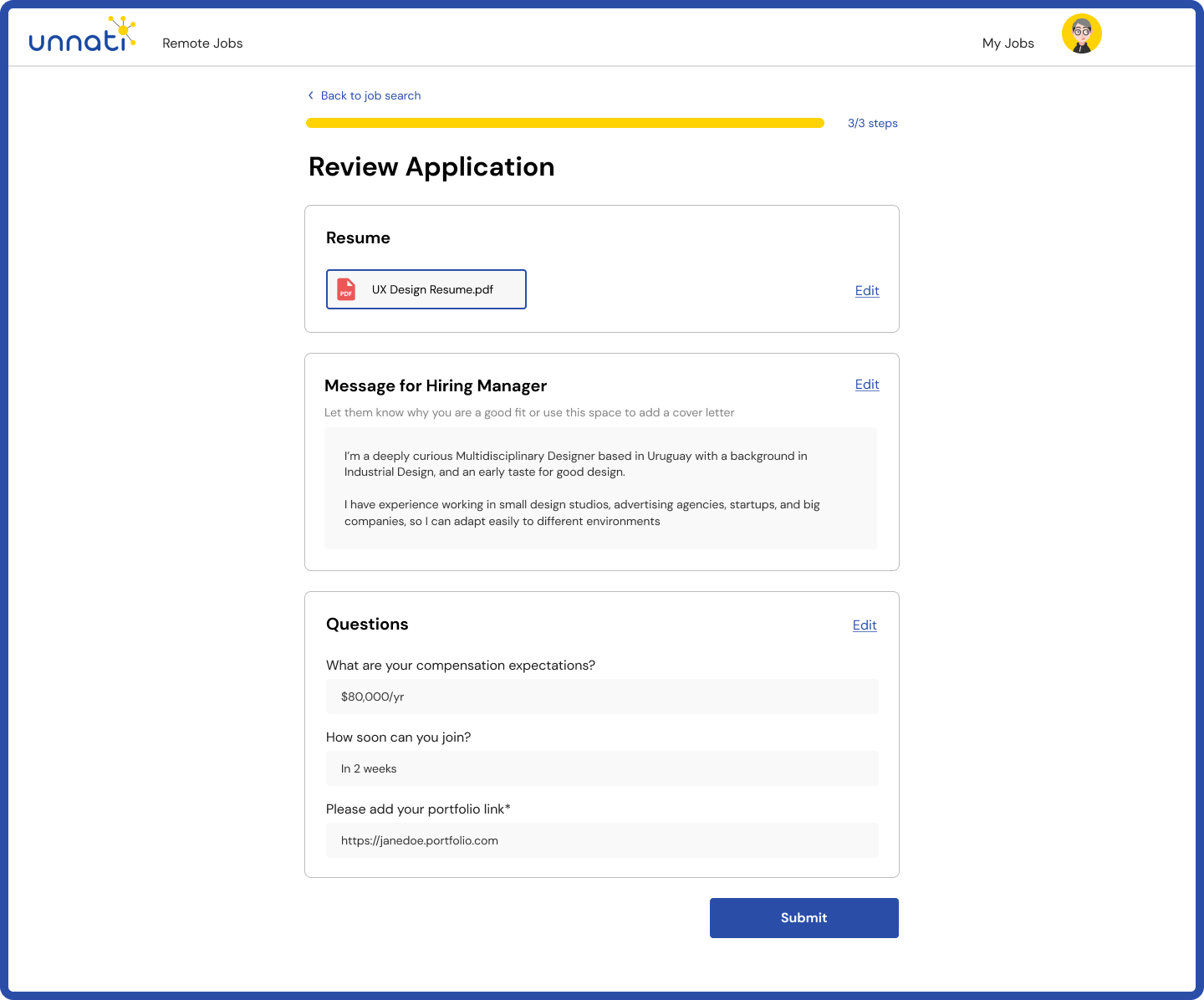
Application Process - Step 3
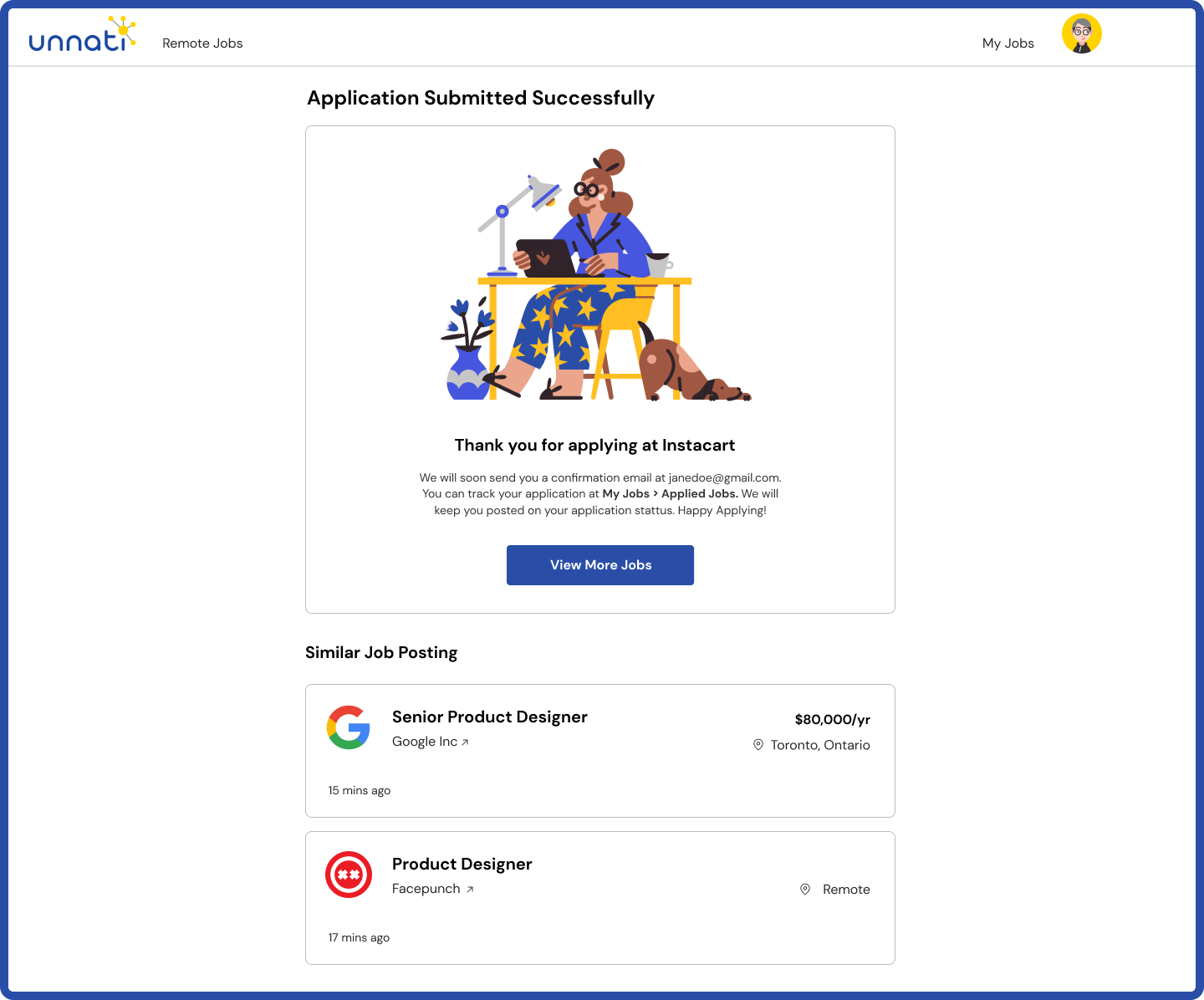
Confirmation
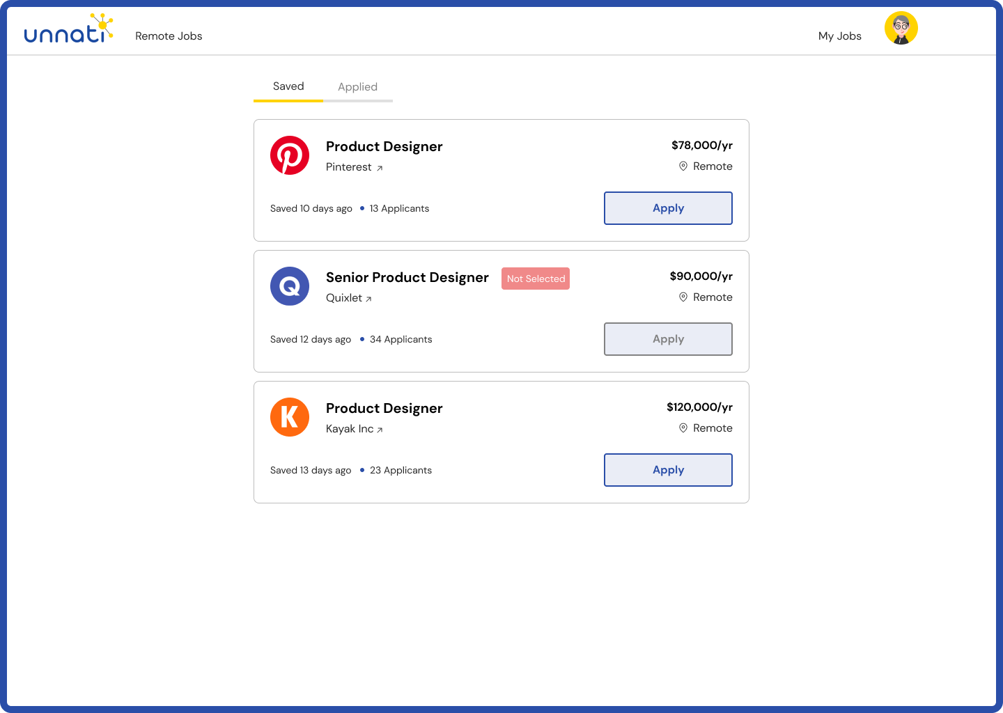
Saved Jobs
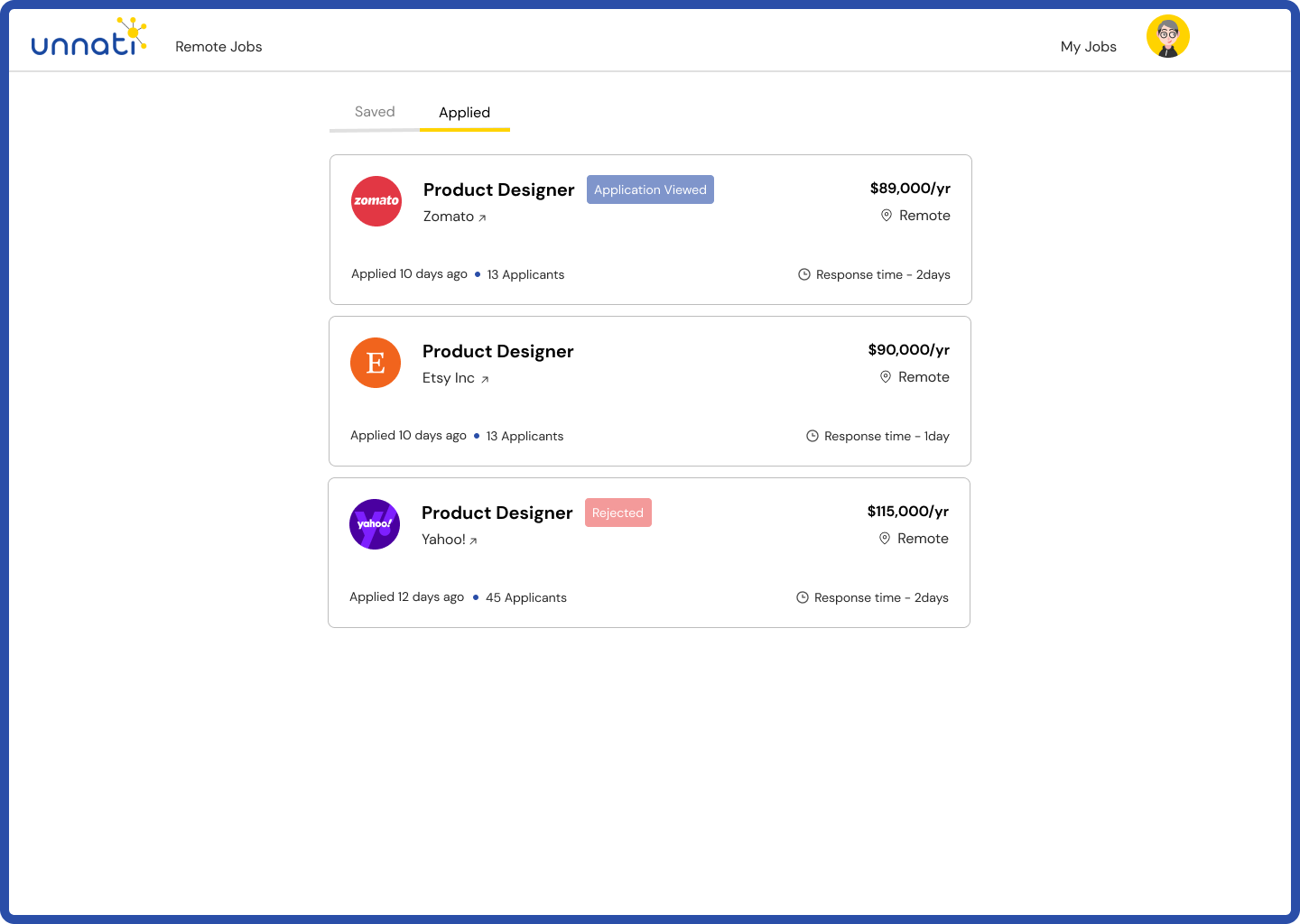
Applied Jobs
My Profile
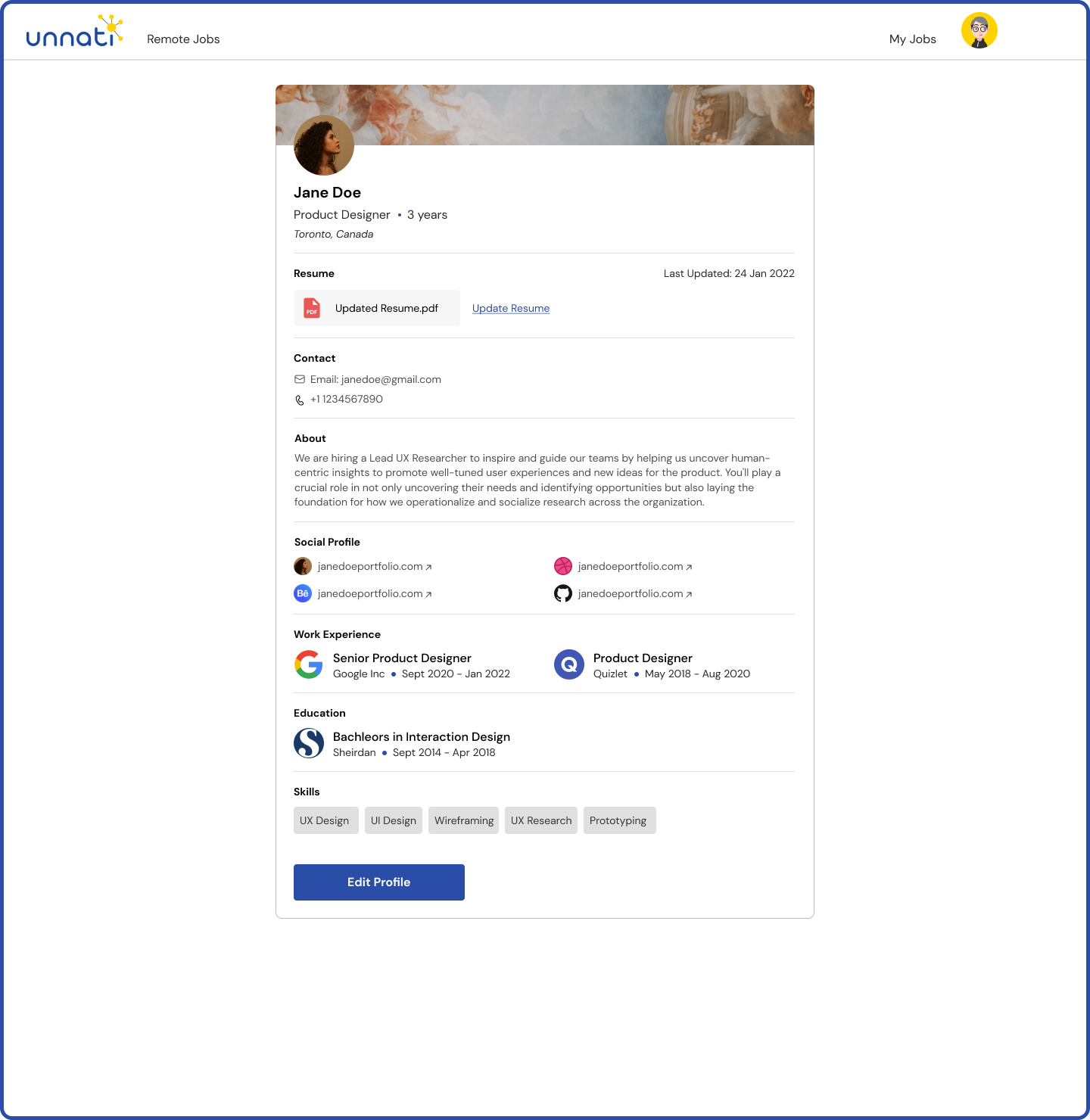
My Profile
Job search and filtering
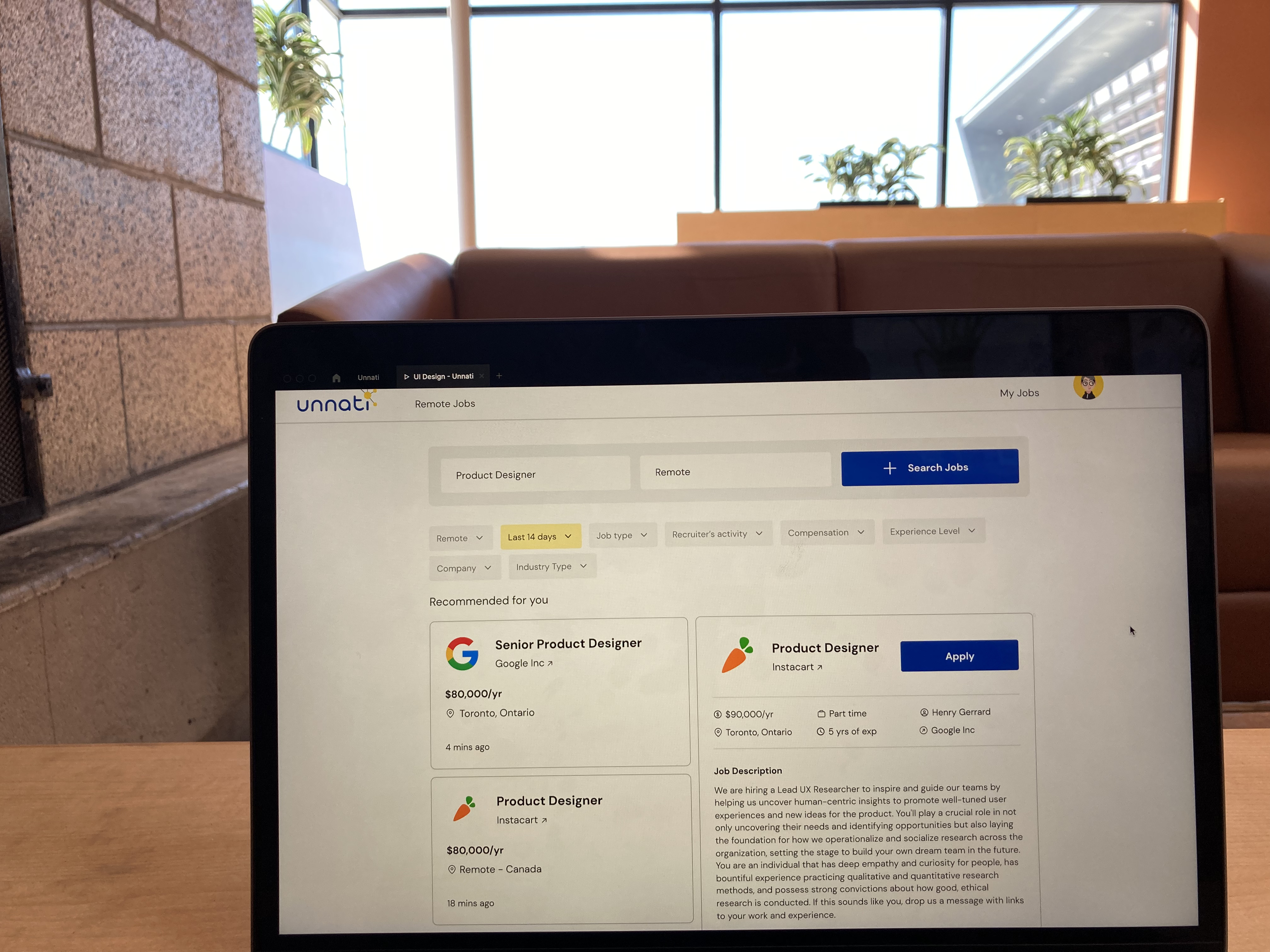
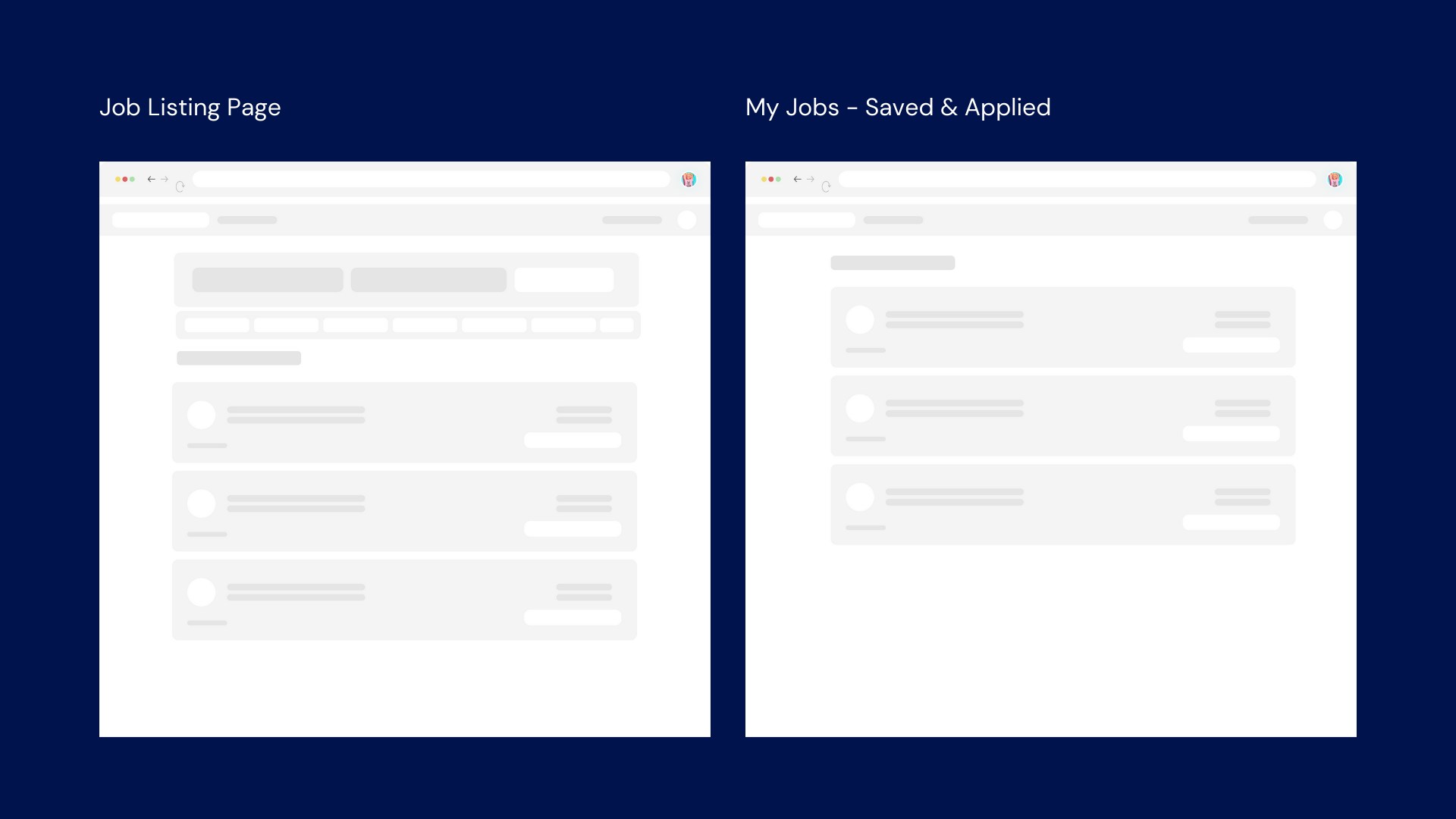
I kept only two most important feilds for search. For deciding filters, I took the insights from research conducted into account.
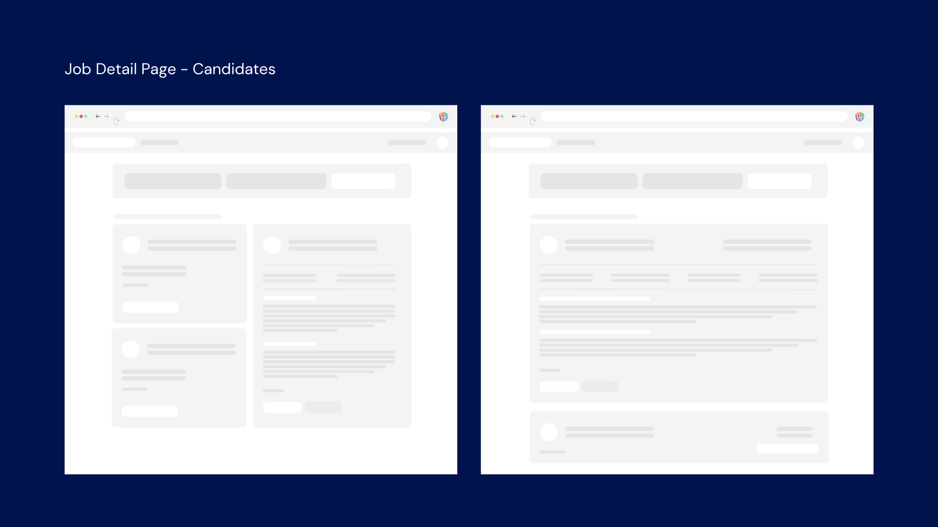
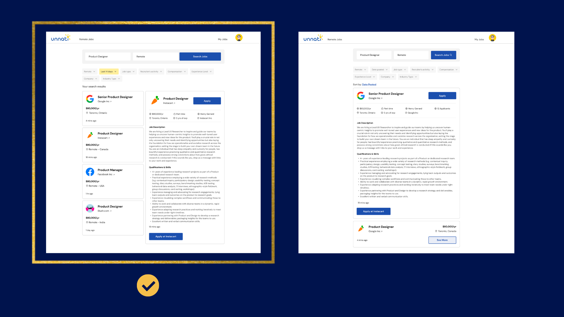
Job Application Process
I started off with 2 design since, I was not able to figure out which one would work best for the candidates- one with spilt layout or the one with card expandings. After doing user testing with a couple of potential candidate, I came to the conclusion that the one with spilt layout is easier to navigate and quick to look through the job description for candidates.
My Jobs
This section has two parts - saved and applied jobs. Saved jobs is where all the jobs saved from by the applicant will be visible with a CTA to apply immediately. This feature was a new additio in existing portal. For the applied jobs, job applicants will be able track status of their application and see how many number of applicants are there on a particular applied job.
My Profile
This will a public profile of a candidate where all the personal & professional data of a candidate will be stored. This profile consists of the common questions which a recruiter might have and which were asked during job application process in existing portal.
Prototype
Play it yourself